
There's More To Creating Heroic Product Photography Than Meets The Eye - The Exoskeleton of Chronometry
High End Product Photography is Fine Art In A Commercial Market
While it’s easy to simply take an image at face value, there’s often more to it than meets the eye. In addition to the technical aspects of creating heroic product imagery, you might be surprised at the amount of thought and level of detail that goes into producing a single product hero shot.
From my perspective as a working commercial photographer and digital artist specializing in product photography, I view high end commercial product photography as fine art in a commercial market. Though art is highly subjective through the eye of the beholder, in my mind, if it’s something I’d hang on my wall or put in my home, I’d consider it to be a form of fine art.
The Exoskeleton of Chronometry
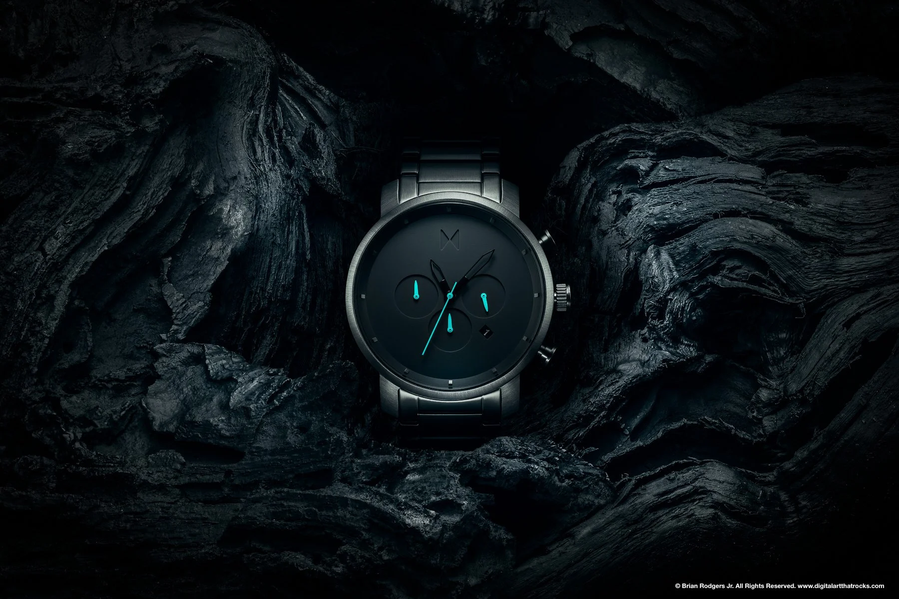
I call this watch image “The Exoskeleton of Chronometry.” Chronometry means “the science of accurate time measurement.” The word “exoskeleton” refers to a rigid external covering providing both support and protection. A watch is literally the face of what we interpret as time.
Symbolism in Product Photography
Much like literary works of art, if you read between the lines so-to-speak, other forms of art such as paintings, sculpture and even commercial product photography can also have symbolic meaning. Looking deeper into The Exoskeleton of Chronometry, for example, these two opposing surfaces might appear to have nothing in common, yet, they both symbolize the concept of "time." Similar to the face of the watch, wood also tells the story of time in a scientific yet abstract way. The blackened driftwood and the watch are made from completely different materials; yet they both have the ability to tell time. This seemingly hidden symbolism also creates an interesting visual dichotomy between these two objects.
The Concept of Time in Advertising
The concept of time runs deep. After all, it's the most precious thing we have in our lives…the one thing we never seem to have enough of. The concept of “Time” has been used in advertising forever. Think of all the products and services aimed at saving you time. How many ads have you seen that tell you "It’s time for an upgrade”? The end goal being that you'll purchase the latest iPhone. Or maybe it’s time to make your heart healthier by eating Cheerios. You get the idea.
Why This Image Works
The Exoskeleton of Chronometry is an alluring, dark, mysterious, precise and pristine image. The seemingly opposing materials work together harmoniously in this image because of the time spent in pre-production by conceptualizing and pre-visualizing the final shot.
Composition
Compositionally speaking, I completely avoided the rule of thirds in order to put the watch front and center. I strategically placed the asymmetrical patterns found in the ethereal driftwood to create leading lines into the face of the watch.
Lighting
When photographing products, I often apply the same lighting principles of illuminating the face in a portrait. For example, I lit the face of the watch using a butterfly/paramount lighting approach. This type of lighting is commonly found in fashion and glamour, but also worked well in creating a high end look for this product shot. The strategic placement and quality of this light added mood and desire to the image. The pockets of light that I created also help build contrast and further emphasizes the form and shape of the watch.
Color Palette
Blue has an association with the environmental elements as it's the color of the sky and the sea. It’s often associated with depth and stability. The color blue also symbolizes and promotes trust, reliability, confidence and masculinity. These colors are perfect for a hero shot of a mens watch. With these descriptors in mind, applying and enhancing the monochromatic blue color palette puts emphasis on the hands of the watch, while the blue tinted color grade simultaneously unifies color harmony of the image.
Can Fine Art & Commercial Value REally Co-Exist In The Same Image?
Creating an image that someone wants to keep around for a while is what makes a great advertising image in my book. My younger self would often cut out ads from guitar magazines to hang on my wall and inspire me throughout the year. As an adult, The Exoskeleton of Chronometry is a piece of fine art that I'd proudly hang on a wall and admire in the same manner. Fine art and advertising can in fact co-exist in a single cohesive image. High end product photography truly is fine art in a commercial market.
Do you need creative, heroic product photography for your next advertising campaign? Do you want larger than life visual assets for a more impactful and successful product launch? When every detail matters, brands choose Digital Art That Rocks.™