Time Saving Tips For Commercial Photographers | Brian Rodgers Jr. Commercial Photographer South Bend | Digital Art That Rocks

Let’s face, we as photographers LOVE gear...until we have to carry it around of course. If you’re a working photographer like me, you know the necessary burden of carrying gear around to complete a job. Cameras, tripods, lenses, strobes, softboxes, light stands, booms, and usually some sort of seamless coupled with the stands to hold it up. And these are just the basic items you may need for any given job.

For many jobs, I work on location. I’m often on location to shoot corporate head shots for a local dental practice. I typically shoot these doctor portraits on a white seamless in a very very tight space at the dental office. Shooting on location makes things much easier for the client; the art of client services. Because I shoot these portraits on location, the job requires me to carry gear up and down a flight of stairs, as well as move a ton of office furniture out of the way in order to make these shots happen. As you can imagine, this can take a lot of time.

My goal with this blog post is to help working photographers think of ways they can save time, by observing the locations they are shooting in, and carefully considering what gear they actually need for the job. 

Pay Attention To Your Surroundings

Always pay attention to your surroundings on any given photo shoot. If this is your first time in a location, pay careful attention to the details, as you may find yourself shooting in the same location again, providing you have a lasting relationship with that particular client. Since I almost always shoot these portraits in the same room for this particular client, I've found ways to simplify my process and work more effeciently. By simplifying my process, I've cut down on the amount of time it takes to set up as well as eliminated non essential gear from my bag. 

When shooting on location for a repeat client, here area few details you may want to pay attention to:

1. AC Outlets. It’s good to know where the outlets are. When you know your location, you’ll know if you need extension cords or power strips for your studio strobes. This is particularly important if you are shooting commercial vehicles in a large warehouse, where AC outlets are spaced farther apart than your typical office setting.

2. If you are using natural light to light your subject, it’s important to pay attention to the direction of light in relation to the time of day you are shooting. (If you are using strobes, this may or may not be as important.)

3. Be mindful of furniture you are moving. It's always good practice to try to put things back as they were before you arrived. Again, this goes back to customer service. Tip: take a snapshot of the room before you move anything. This gives you a reference as to how the room looked when you first arrived, making it much easier to put things back. Most clients will appreciate this.

4. Also, look for things that can potentially save you time, or work to your advantage in some way. For example, Though I always shoot these portraits on a white seamless, it occurred to me that there was a nice white dry erase board in the back of the room that i could use to my advantage…..Hmmm….

Be Resourceful
1. To save time on setting up, I decided to use the dry erase board as my background instead of setting up the seamless. I get the same look of a white seamless in less time, problem solved….Until there is writing on that dry erase board. Then it’s a good idea to unpack that seamless you left in your car just in case. You did bring the backup seamless just in case… right?!

2. I use the same lens on all these particular portraits, so there is no need to pack every lens that I own.

3. Instead of using two background lights to light the seamless (dry erase board in this case), i only use one for these particular shots. Since I'm shooting tight and only need to light a smaller portion of the background one background light does the job. This also saves time on setting up.

So these are just a few ideas to hopefully get the gears spinning in your head, to help simplify your process. Remember to think about these things. You just may find yourself in that location again ;)

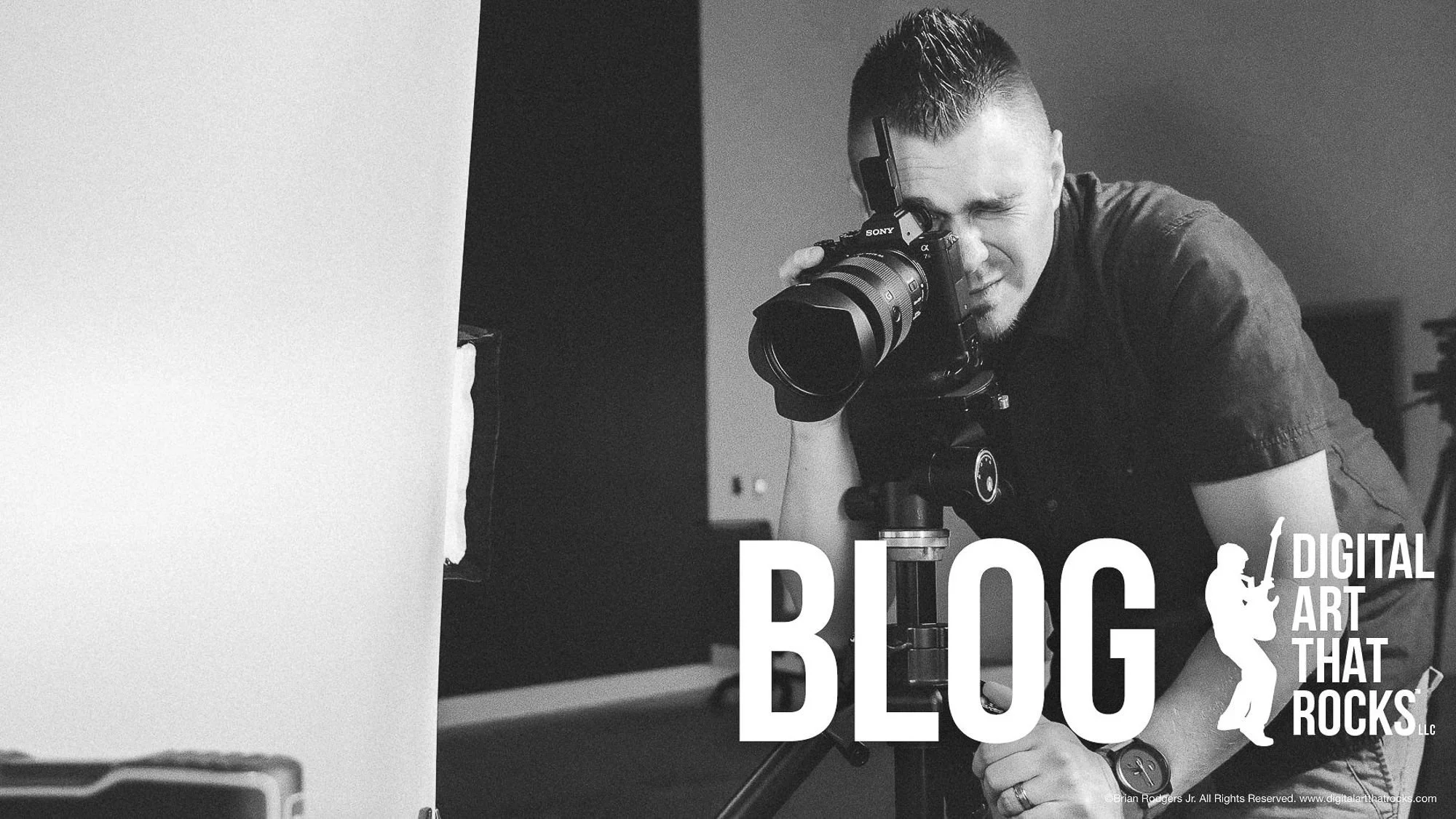
Lastly, I have included a quick pre-production shot of the dry erase board that I turned into a “seamless” and a quick self portrait. Time saved is time well spent.


Commercial Beer Photography South Bend | Brian Rodgers Jr. | Digital Art that Rocks

commercial-beer-photography-south-bend-indiana-beverage-photography-brian-rodgers-jr-commercial-photographer-digital-artist-digital-art-that-rocks

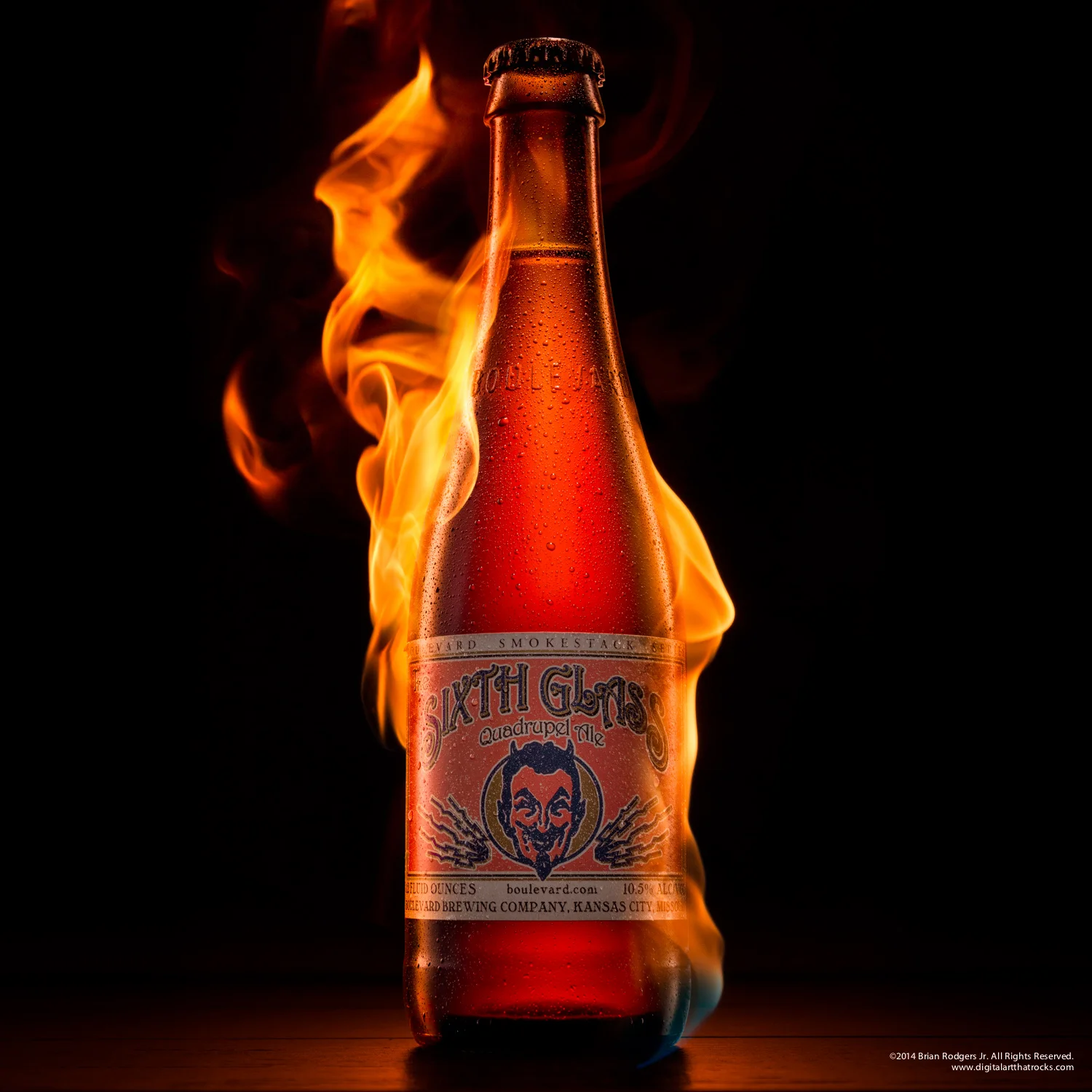
What do you get when you combine, a sexy bottle, amazing light, some fire, and Avenged Sevenfold piercing through your speakers? You get commercial photography that rocks!

I'm just going to say it, I love a good challenge. And this bottle was no exception. I love shooting liquids and bottles because each shoot is different. Every bottle and liquid has it's own unique characteristics. There's something about the way light and liquid play together that really ignites a fire inside me. This shoot was a little different because I introduced a new level of complexity into the shot; That's what my studio Digital Art that Rocks LLC is all about, taking images to the next level.  

Adding fire into the mix was both exciting and a little dangerous. I think the end result speaks for itself. And as with every project I take on, I let the music guide me. For this shoot as mentioned earlier, Avenged Sevenfold was my inspiration. The pyrotechnics of their live show and intensity & precision of their music influenced me in the creation this stunning image. 

Brian Rodgers Jr | Commercial Photographer/Digital Artist | Digital Art That Rocks LLC

A Commercial Photographer's Guide to Animated Gifs in Photoshop CC | Brian Rodgers Jr. South Bend Commercial Photography

Often times we see animated gifs in the form of humorous animals doing funny things in the context of an email or social media site. However, in this tutorial, I'm covering a more practical use to approaching animated gifs. I'm calling this tutorial "A Commercial Photographer's Guide to Animated Gifs in Photoshop CC."

Depending on your client, it's a safe bet to say that they are not experts in the field of photography. Some clients have a better understanding than others, however, it is our job as commercial photographers to educate our clients. In this tutorial, I will show you an effective way to create animated gifs that visually demonstrate the creative post production processes we endure to create a finished retouched image.


The Grid: The Path to Inspiration Episode 142 | Brian Rodgers Jr. Commercial Photographer/Digital Artist

Hey everyone! As photographers and artist's, we all need sources of inspiration. We use that inspiration as fuel to ignite our own creativity. What inspires you? Music has been a driving force in the creation of much of my work over the years, even at an early age. There's just something about the feeling you get when listening to music that moves you. When I'm shooting and retouching, I'm always listening to music. I truly believe that for me, it helps shape my images and the mood they create. It's that feeling that drives my creativity. For some reason I can always turn on Oleander's latest album Something Beautiful and get into my creative zone. Great album! And it's really cool to see an awesome band that went away for a while come back with such a powerful record. Check it out!

I just happened to be watching last weeks episode of The Grid. The episode focused on The Path to Inspiration. I am absolutely honored to have been referenced in the discussion for my automotive self assignment (I'm referenced at about 34:20 & 1:03:15) I've been watching The Grid since it first aired and I'm a huge fan of the show. Kelby Media has been such a huge inspiration of mine for a long time.

I just wanted to thank Pete Collins for sharing my work on the air and for posting to the NAPP (National Association of Photoshop Professionals) member site. I also wanted to thank RC and Mia as well.

What inspires you?

• Check out last week's episode of The Grid!

• You can see the automotive self assignment here

Commercial Automotive Photography Retouching Time-Lapse | Brian Rodgers Jr. South Bend Commercial Photographer/Digital Artist

NEVER THROW AWAY YOUR IMAGES, YOU MAY END UP USING THEM AS BACKGROUNDS

Recently I went out and shot an automotive self assignment. The subject: a Ford Focus Titanium. I think the overall design of the car speaks volumes over it’s predecessors, and I really wanted to capture that in this composite image. I cannot stress enough that self assignments are worth your time. You need to shoot for yourself, not just for clients. It’s the only way you will ever bring out your true vision as an artist.  

The Studio: I used an empty parking lot as my studio for this shoot because I knew that I wanted to build a composite shot of the car in some kind of scene, at the time of shooting, I had no idea what that scene would look like. 

IF YOU WANT TO GET A PROFESSIONAL COMMERCIAL AUTOMOTIVE SHOT, IT STARTS WITH COMPOSITION. PERIOD.

Composition: The composition for this shot was so important! I can’t stress that enough. If you want to get a professional commercial automotive shot, it starts with the composition. I suggest looking at a lot of commercial automotive photography for inspiration. Look at where the light falls on the vehicle. Notice that this front 3/4 shot of the vehicle shows off the design of the car? Notice the interior details? 

The Lighting: I used natural light for the most part. I paid very close attention to where my light was falling on the vehicle. Notice that beautiful horizon line that paints the landscape on the side of the vehicle? How about that beautiful light that kisses the hood of the car?  That was completely intentional. You really have to pay attention to the details on a shot like this. If the car had been positioned in a different direction, the light would have looked completely different. I used a speedlight to light the interior of the vehicle ever so slightly. Even though this shot is primarily an exterior, It’s important to show some interior detail as well. 
 

Here is a behind the scenes image of me light painting the vehicle as the sun started to go down.

Here is a behind the scenes image of me light painting the vehicle as the sun started to go down.

The Composite: I had no idea what the background would end up being until I started building it. I shoot backgrounds all the time and keep a library of images that I can pull from on any given day. In the video, you will see me experimenting with some different backgrounds. They all looked pretty good, but I thought the mountain range worked perfect for this shot. The background was derived from the smoky mountains of Tennessee during a family vacation. I shot them years ago, with no intention of ever using the as a background for an automotive composite, in fact I was using a point-and-shoot camera at the time.  With Photoshop and a little creativity, the possibilities are endless! So never throw away your images, you may end up using them as backgrounds someday ;)

Composite side notes: Notice that the background light matches the light on the car? When looking through your library of backgrounds, keep that in mind. Look at the overall direction of light. Also, I knew that when building this composite image, that the foreground would work to my advantage. I had a little cleanup to do on the pavement, but I didn’t have to go out and shoot separate pavement and build a new shadow for the car. I used what I had shot, defined the horizon line of the image, and composited in a background that I thought fit the car. For this shot, I wanted to convey traveling in style. If this image makes you want to to test drive this car, and possibly buy it, this image has served it's purpose.

Brian Rodgers Jr. of Digital Art that Rocks featured on the popular web based photography show "The Grid" Check it out at 35:12 & 1:03:15 minutes into the show!

Until next time, Rock & Roll

-Brian

Desaturated High Contrast Effect for Commercial Portraits in Photoshop | Brian Rodgers Jr. South Bend Commercial Photography

hidden Photoshop gem: you can use adjustment layers and simply change the blend mode without having to use the adjustment layer for it’s intended purpose.

In this tutorial I will show you how to get that really cool desaturated high contrast portrait look you see in so many commercial portraits. Now keep in mind, this is only one way to achieve this effect. We start by duplicating the layer twice; press Command + J and Command + J again. Select you first copy (should be your middle layer) and press Shift + Command + U to completely desaturate the layer. Change the opacity of that desaturated layer to 40%. Then turn on your top layer (copy 2) and change the blend mode to soft light (Shift + Option + F). Lastly change the blend mode to about 50% opacity. Keep in mind that each image will be a little different. Now, that’s one way to do it, on to tip #2! 

Tip#2, Now we are going to achieve that same effect using adjustment layers and blend modes. This time, start from your base layer and add a black and white adjustment layer above that. Set the opacity of the black and white adjustment layer to about 40%. Now create a curves adjustment layer above that. Change the blend mode of the curves adjustment layer to Softlight (Shift + Option + F). Now set the opacity of the Softlight adjustment layer to around 50%. Boom, same results achieved. 

So what’s the difference between these two methods? Well, by using adjustment layers instead of duplicating your base layer, you are creating a smaller Photoshop file, thus saving hard drive space. If you have a Photoshop file with a few layers, the first method is just fine. However, when you retouching commercially, chances are, your files will be growing Popeye arms in no time. So working smarter in Photoshop can not only save you time (because your files will run and save faster) you will also save money (takes less hard drive space; consuming less storage and working faster puts more money in your pocket). 


Lastly, this is a hidden Photoshop gem: you can use adjustment layers and simply change the blend mode without having to use the adjustment layer for it’s intended purpose. For example, in this tutorial, I didn’t use the Curves Adjustment Panel to modify the curve in any way shape or form. I simply added the adjustment layer, and used it for a blend mode, which is the same as duplicating a layer and changing the blend mode…the only difference is, adjustment layers are much smaller and rarely add to the size of your Photoshop file. Furthermore, you can use almost any adjustment layer in this manner. You can do the same thing with Bightness/Contrast, Levels, Curves, Exposure, Brightness, Hue/Saturation, Color Balance, Channel Mixer, Color Lookup, & Selective Color, I just tend to stick with curves (personal preference). You may notice that I didn’t mention all of the adjustment layers. Here’s why: When you add a Black and White Adjustment Layer, an effect is automatically applied, you can still change the blend mode, but you cannot use the adjustment layer simply for the blend mode. Same goes for the Photo Filter adjustment layer, as soon as you apply that adjustment layer, it applies an effect automatically, thus changing the image before a blend mode is applied. 

There you have it, two 2 tips in one this week! 

Rock N' Roll!

Subscribe to my Youtube channel here: http://goo.gl/dII9r6


How to Convert White Products to Black Products with Ease in Photoshop | Brian Rodgers Jr. South Bend Commercial Photographer/Digital Artist

Your Photoshop Questions Answered: How to convert a white product into a black product with ease in Photoshop

I had a question come in from Google+ and wanted to answer it in this in this Photoshop tutorial. In this example, I’m using a stock image to demonstrate how to take an object that is completely white, and convert it to black while still retaining all of the original detail. I will also demonstrate how to do the opposite; turning black to white. This technique is very helpful in commercial retouching.

I would also like to add that while this technique works great, every image will react a little differently. I recommend using 16bit high resolution files within ProPhoto RGB color space, in other words you want the widest tonal range possible. Lastly, keep in mind that when you convert white to black, there are characteristics and qualities of light that you need to keep an eye on. White is additive light, black is subtractive light. In the stock image example in the tutorial, the teacher has a white shirt. That white shirt is adding and reflecting light on his skin. So when you convert it to black, his skin seems a little out of place, because a black shirt would create subtractive light from the subject. My advice would be to burn down the areas of skin (using a dodge and burn technique of your choice) near the black shirt. This would create a more believable conversion. I opposite would go for a black shirt being converted to white. I would take the darker areas of the skin, and dodge them a bit to match the quality of light.

I hope this helps, and if you would like to see more Photoshop tutorials, please leave a comment below and subscribe to my youtube channel. 

Color Conversion Retouching Technique with Photoshop CC - Brian Rodgers Jr. Commercial Photographer South Bend

This technique is great for commercial photography retouching. It can be used for product photography, automotive retouching as well as commercial portraiture.

In this tutorial/video, I will show a Photoshop retouching technique that allows you to change a color in an image to a realistic black or white conversion within minutes. This technique retains all of the detail from the previous color, with little to no masking required.

This technique is great for commercial photography retouching. It can be used for product photography, automotive retouching as well as commercial portraiture. A great example of practical uses for this technique: Let's say you shoot images of a product line for a catalogue. Let's say there are 5 identical products, the only difference is the color. Sure, you can shoot all 5 products, line every shot up to make them look identically shot, or you can use the same shot and convert the colors in Photoshop. With some simple adjustment layers you can knock this out in no time, and all of the shots will look identical, whether they are on an e-commerce page, or inside of a printed catalogue.

Also, while we are only focusing on a black and white conversion in this tutorial, keep an open mind and play around with the Hue/Saturation Adjustment Layer, the Selective Color Adjustment Layer as well. You can create other realistic color conversions with these as well.

Please note, that when using the technique with portraits, minor masking may be required. In the first example, we are turning the red dress into black dress and then into white white dress. Since this color conversion technique requires the primary use of the red slider in the black and white adjustment layer, you will see skin tone change as well. Simply mask it out. If you using this technique on a portrait and you want to convert a color such as blue, you more than likely will not have to mask anything out. Because skin tones will be independent of the blue slider (the skin tones are in the red and yellow slider).

Lastly, this technique is a great starting point to adding additional color to your image. Let's say that I wanted to make the dress a dark purple. I can use this technique and convert the dress to black, then add a purple Solid Color Adjustment Layer on top, add a clipping mask so it only effect the black conversion, and change the blend mode of the Solid Color Adjustment Layer to Color. This would create a realistic purple dress (using the right purple of course; in this case a dark purple would be best)

Hopefully this technique helps you the next time you're in a pinch. If you like this tutorial and would like to see more, please leave a comment below, and subscribe to my youtube channel http://goo.gl/M2VOM2. If I get enough interest, I will be more than happy to produce more tutorials in the future.

Thanks everyone!

Indiana Beverage Photography | South Bend Commercial Photographer Brian Rodgers Jr. | Indiana Liquor Photography

consumer beverage photography. Indigo H20 water bottle hero shot with water splash

I'm commercial photographer and digital artist Brian Rodgers Jr. I'm the founder of commercial photography studio Digital Art That Rocks, LLC. based out of South Bend, Indiana. I specialize in product and beverage photography. If you make awesome products, then I'd like an opportunity to professionally photograph them for you business.

Brian Rodgers Jr. | Commercial Photographer/Digital Artist | Digital Art that Rocks LLC
www.digitalartthatrocks.com | Contact Brian
Instagram | Youtube